Massolit-Media.com
Description: Portfolio website
Platform: WordPress (PHP, CSS, HTML)
Features: Custom post types, custom taxonomies, custom index pages, dual header menus, responsive, mobile-friendly design, custom menu widgets, contact pages, custom metadata
Around the same time I launched the first website that I developed and designed, I started my current job, ending a five-year job search (three years looking at a job while working at a previous position, then another two years after resigning from that position). I don’t miss the job search at all, but I do wonder if my previous job searches would have been as difficult if I had my own website to sell my professional skills. So I created the website you are looking at now, Massolit-Media.com.
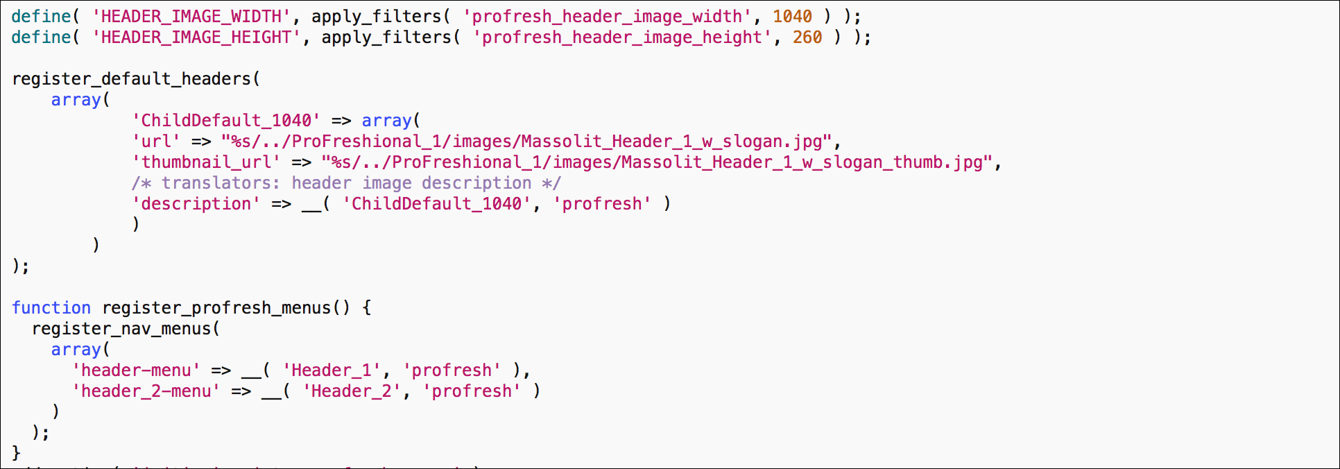
Massolit-Media.com is a WordPress website, customized via a “child theme.” I developed this particular child theme by watching more Lynda.com lessons from Morten Rand-Hendriksen on how to create a custom portfolio website.
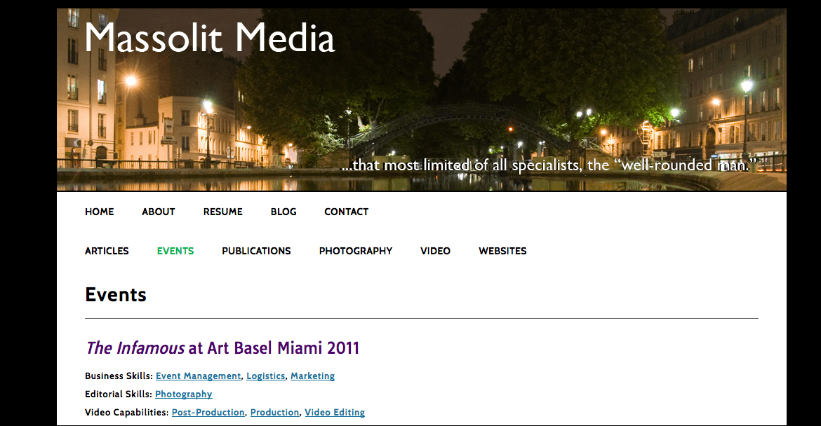
Most of what makes this website special is not visible to the user. To see what makes it different, you have to be logged in to the backend of the site, the WordPress admin section. Most standard WordPress websites consist of two types of content, posts (more ephemeral and fluid, like blog posts) and pages (more static and unchanging, like an about page or a contact page). I added “custom post types” to this site. These act like posts, but they are much more customizable. Using PHP, I created buckets for the six different content types that best describe my professional achievements:
- Articles
- Events
- Publications
- Photography
- Video
- Websites
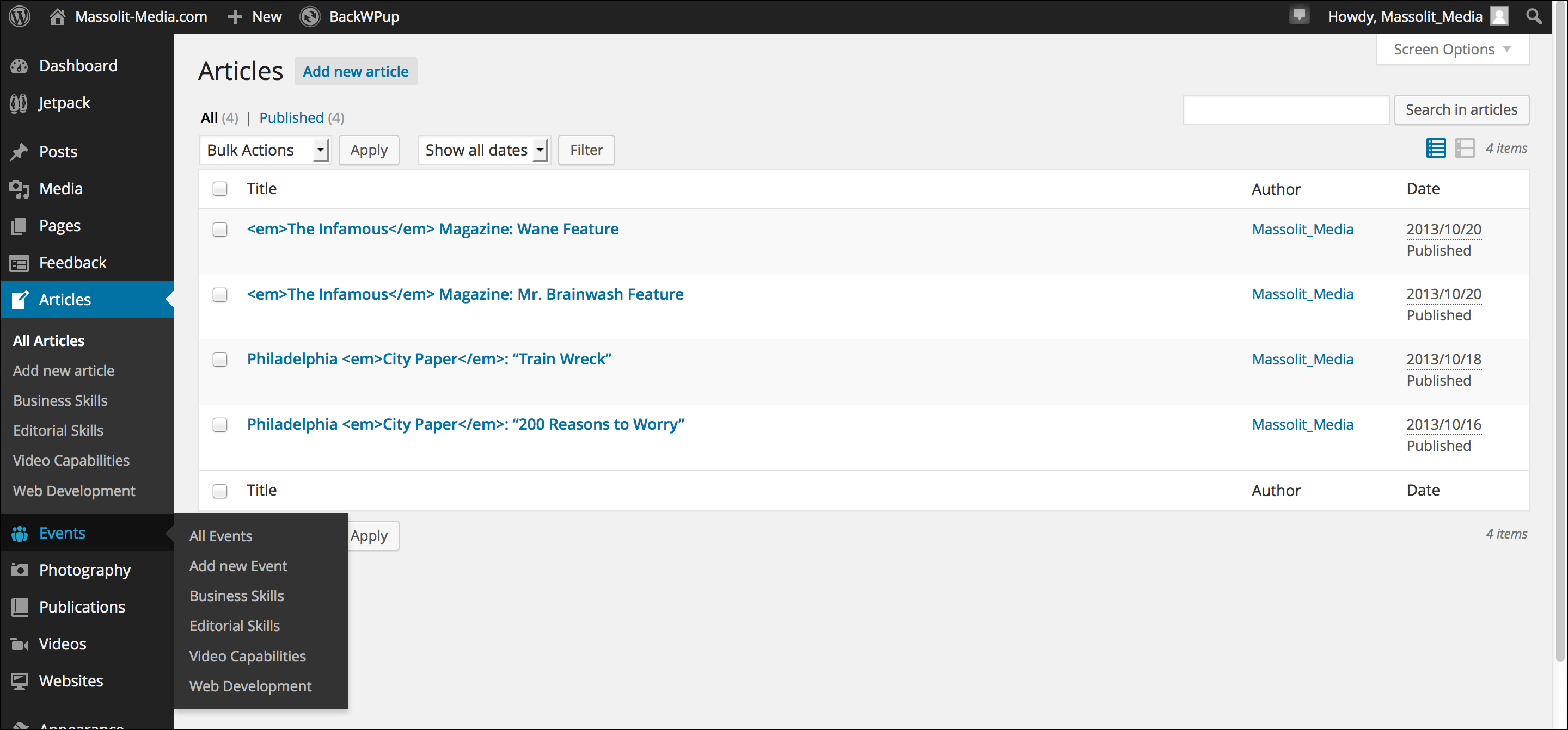
In addition to these six custom post types, I can easily add others as needed. And the idea can be transferred to other business or portfolio websites to showcase different projects or achievements of that organization or person.
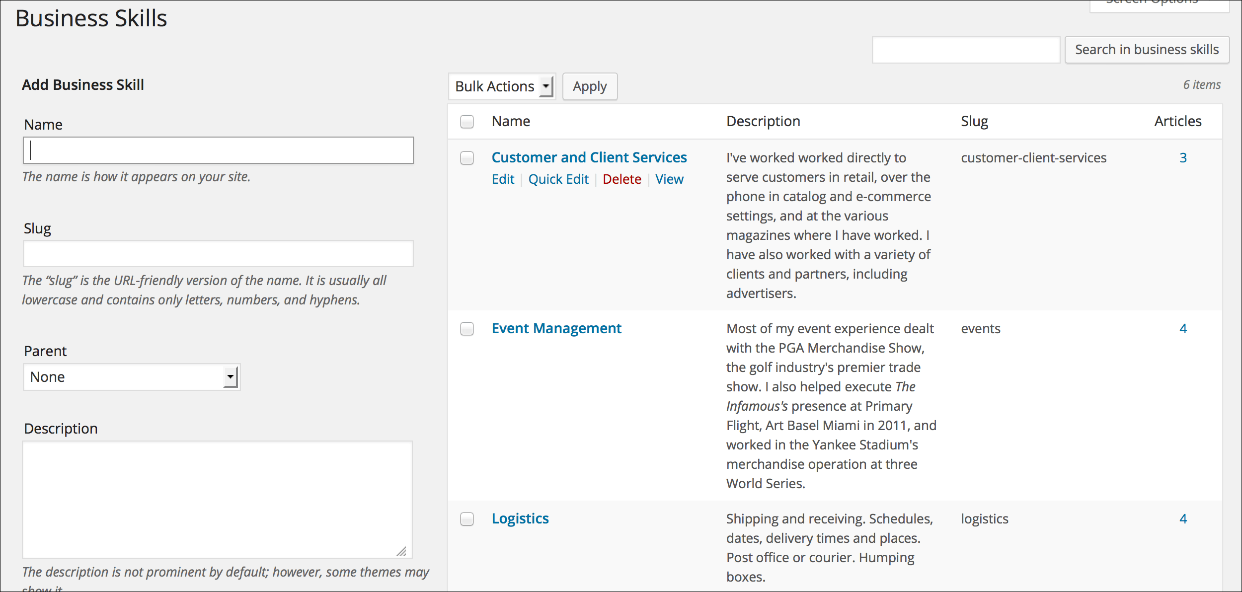
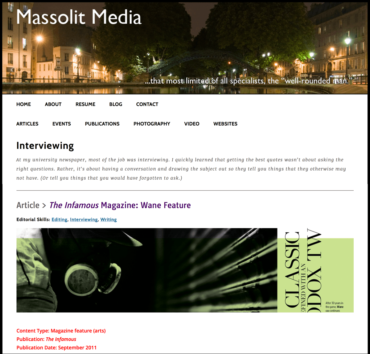
Just as this website showcases the variety of skills I have developed in my professional life, there is a lot of overlap between those skills. (If you go to the page – sorry, custom post type – that details my experience at The Infamous magazine, you can probably see all of them listed in one place.) So I needed a way to remind readers of all the skills that went into a particular project. For this, I used PHP to create “custom taxonomies” that list my professional skills. These custom taxonomies include my Business Skills, Editorial Skills, Video Capabilities and Web Development knowledge.
Now that this information was in the database, I edited the templates using PHP and HTML to display this information for each piece of content:
Each skill or specialty is hyperlinked to an index page of all the other pieces of content that are tagged with that skill, allowing readers to get a more in-depth picture of my experience. For example, the index page on Interviewing contains each post I tagged with Interviewing and includes a blurb about my interviewing skills on the top of the page.
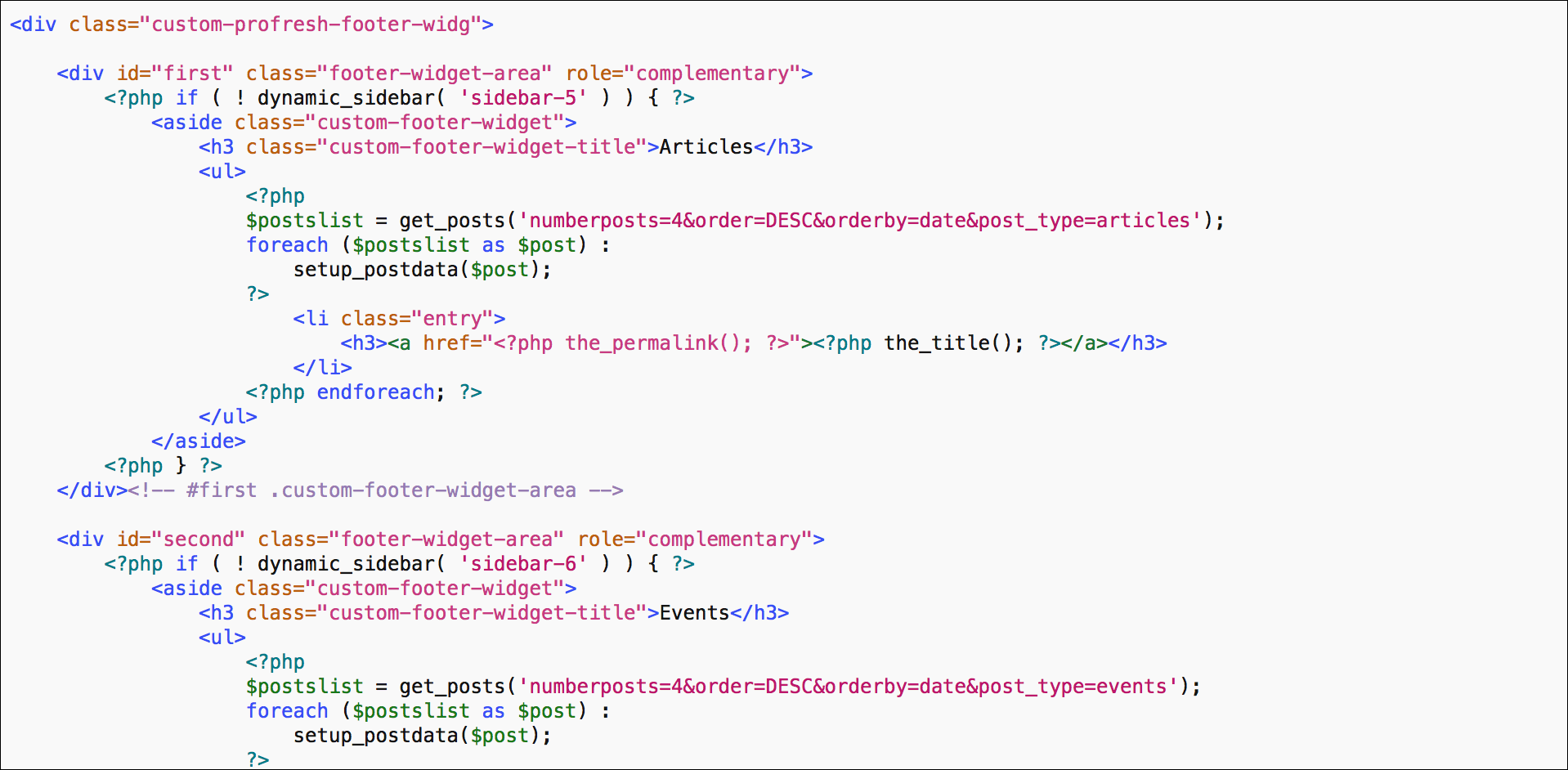
Once I got the website working, I started fine-tuning the look of the site. The first thing I did was add a second tier of menu to my header, because with each of my six custom post types there was no room for standard menu items like About, Contact, etc. I thought this option would be provided by the WordPress admin but it turned out to take a little more work using PHP. I also designed a custom footer menu that would automatically populate each time I added a new item to one of my six custom post types. This menu actually consists of six separate footer widgets, all accomplished in the templates with PHP and HTML.
Now I had to make everything look nice. Admittedly, each of my custom post types display the same way, whether you’re looking at an article I wrote or a video I made. I could change these around, but I have yet to think of a creative way to do so (or find a reason that I need to differentiate them). This website uses white content areas on a black background and black body text – I like the high-contrast look. In the interests of simplicity, this website does not have a sidebar or even a search bar (as of right now, I don’t think I need one).
Next I focused on the CSS. First, since I had changed so much from the parent theme (particularly with the menus), I had to recreate a lot of the media calls that would make the site responsive. Just the footer menu required a lot of math: the width of the main content area divided by six, but only after accounting for all the various padding widths of each div.
On this project I also had access to a PC running IE8. I dislike Internet Explorer and don’t understand why people still use it (especially older versions). But people do use it and I used that to challenge myself to make the site work on IE. Eventually, I succeeded, and it does look OK… but it is strange to think how much more work I did to make the site look mediocre on Internet Explorer on a PC when it looks so much better on better browsers both on a PC and on a Mac.
Another thing that was new to me on this project was the use of Google Fonts to make the text of my website really pop. I don’t consider myself to be an expert on fonts (I was several years out of university and in the magazine world when I learned what “sans-serif” actually meant), but I think my choices work. One of them, Open Sans, has since been adopted by WordPress as its default font, so I was a little ahead of the curve on that one. I’m not wild about all of the hover and link colors I have chosen, but can change any of these things whenever I have a better idea.
There are a few other things I have done for this website, such as customizing the metadata (it displays for blog posts, not for custom post types), and I intend to continue redesigning it in the future to further build my skills and try out new WordPress themes. In the meantime, I quite like it and think it showcases both my professional experience and my newly developed web skills. Maybe I will even update the blog one day.